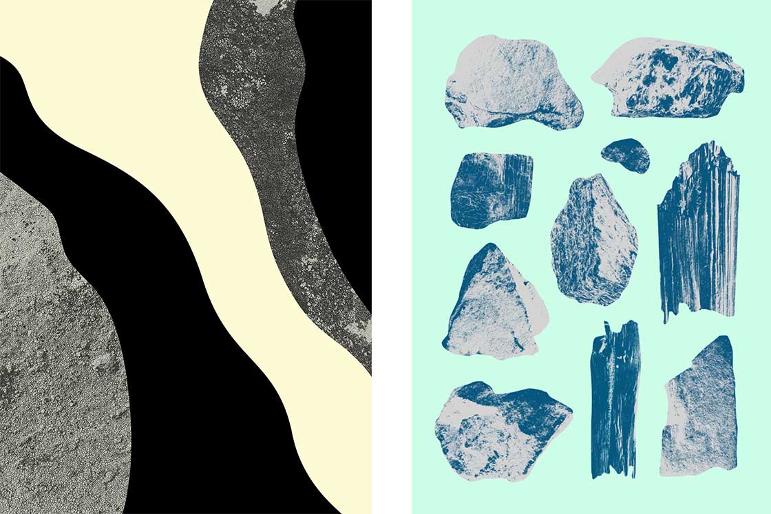
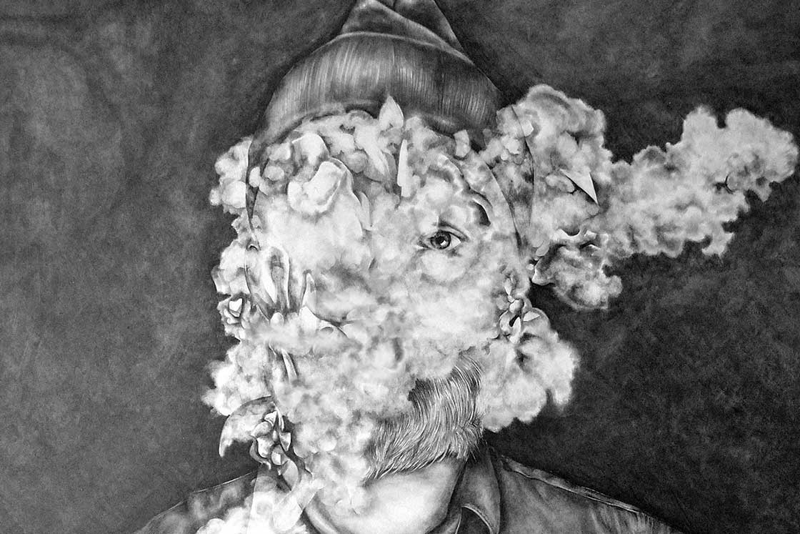
The project will culminate in a bespoke 10’’ vinyl that places music from four cities in one place, taking a passport stamp style trip across Europe and recounting the sights and sounds through prevailing musical scenes and cultures. Continuing the musical odyssey to Oslo, a city encapsulated in the iconic black with yellow striped design, the 10’’ will feature sleeve artwork produced by Oslo based designer Hans Christian Øren – an artist whose abstract surrealism riffs on the subtlest notes of the Oslo city skyline.

Can you tell us a little bit about your artistic practice? How long have you been drawing, making and creating?
I have always been interested in creating, but I didn’t understand what or how to put it into practice. It was only after taking on a six month course in graphic design and web design in 2002 that I found my professional and passionate path in life. From there, Oh Yeah Studio was established in 2009 with my girlfriend, Christina. It has developed from a hobby-project into what it is today; a multidisciplinary design studio.
In the beginnings it was just a playground where we could be creative without clients. It was just something that we could pursue after dinner or in the evenings. It was a place where we could do whatever we wanted without anyone telling us to ’change that’ or ’do this instead’. We developed an exhibition together with the emphasis to develop our own distinct style and expression. But being partner with your girlfriend is not easy and after some years of hard work we decided to split as professional partners. Thankfully she is still my girlfriend, and my mentor and advisor, whom I can trust give me an honest critique, good or bad. I’ve continued with the studio, and more recently become a Creative Director at Bekk Creative Consulting.

How has growing up in Norway influenced the style of your designs?
I have lived in Oslo around 20 years, but in between that I have lived in Bergen and studied at Central Saint Martins in London. I have always been inspired by international designers, but there are many good agencies and freelancers in Norway that influenced me along the way. I believe Norway has a distinct style, but it’s not something that I’m overtly part of. Or something that I have given too much consideration to before. I have just tried to do my own thing, and not limit my creative work to fit a certain trend or style. My style is basically a result of many years of experimenting in school and in personal projects. It has been lots of mistakes and many years of working 15-hour days and weekends. I looked at it as a hobby and just wanted to create, explore and evolve. After many years of hard work I suddenly found something; I combined surrealistic drawings inspired from Dali, abstract art inspired from constructivism and El Lissitzky, the thoughts of the unconscious and my love for experimental typography. A big soup of experiments led to the style I have today.
Are there any particular Norwegian references in your work?
I am especially inspired by the abstract artist Gunnar S Gundersen, but I also was fascinated by Grandpeople, Bleed and Non Format when I studied. But if I have to mention one it is Gunnar S Gundersen without doubt.

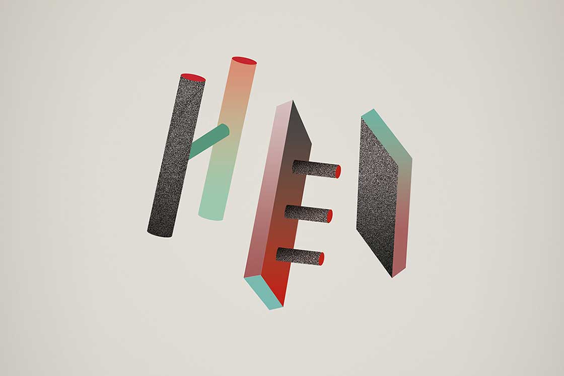
What was the idea behind the typography used on the City Series cover design?
The typography was inspired by the modern architecture in Oslo. As I went out for a stroll for inspiration, I started combining lines and shapes from buildings like the new Opera House, The New Munch Museum, Barcode and The New Deichmanske Library. Since the design should represent Oslo in some way, I thought this was something that I could communicate in an abstract way. I like how letters can give a sense of feeling and awaken emotions in the subconscious.
In some of your sketched designs, you touched on how Oslo was the tiger city, which derives from a legend in a poem. Is there quite a strong folk tradition in Oslo, and does this feed into your creativity?
For many people in Oslo, the concept is positively charged and used with pride. But I don’t think there many people think of the Poem of ‘Godt Mot’ written by Bjørnstjerne Bjørnson's in 1870 when they refer to the city as ‘Tigerstaden’. The poem describes a struggle between a country horse and a tiger that had become a symbol of the city. Due to the prevalence of the ‘Tiger City’ idea, it was a natural route that I followed when I started to brainstorm around the word Oslo. Therefore it felt like a natural world to explore in the initial designs and inspiration for the cover artwork.
How would you sum up Oslo’s contemporary creative scene?
I think Oslo has been one of the best cities for design craft for a long time, but I can see that it is more experimental and explorative than before. There has been a number of creative visionaries that have led a strong voice and set the tone in Oslo, but I don’t think they are so dominant anymore. There is now more variation in expressions and especially solutions. But this is maybe something that Oslo (and Norway) is best at; the combination of a strategy, a good concept to give a works a distinct expression.

The Oslo adidas Originals City Series will be available to purchase form SEVENSTORE from 5th October. SEVENSTORE x adidas Originals 10’’ record will be gifted with purchases of the London City Series, Oslo City Series and the final city series release in 2019. The full collection of artists included on the record are set to be announced in the coming weeks.
Words by Bido Lito!
Images from Hans Christian Øren - Oh Yeah Studio, Oslo.
Explore more:


